Good afternoon. Have you tried to make an iframe HTML element with YouTube video inside to be mobile responsive that will adjust on different canvas or screens? If you find it difficult to do, I will teach you how to code it with the use of CSS only. Before we start this useful tutorial, you must have at least a basic understanding of HTML and CSS. If not yet, I prefer you to visit W3schools website to learn the basics.
No more further ado, let’s start coding!
Setup the HTML structure
In this HTML structure coded below, you will see the iframe HTML element with a YouTube video inside enclosed with a class called resp-container. The iframe itself has a class as well called resp-iframe.
    <!DOCTYPE html>
    <html lang="en" dir="ltr">
        <head>
            <meta charset="utf-8">
            <meta name="viewport" content="width=device-width, initial-scale=1.0">
            <title>Responsive iFrame With YouTube Video Inside Tutorial</title>
        </head>
        <body>
            <div class="resp-container">
                <iframe class="resp-iframe" width="560" height="315" src="https://www.youtube-nocookie.com/embed/juGlKj79quc" frameborder="0" allow="accelerometer; autoplay; encrypted-media; gyroscope; picture-in-picture" allowfullscreen></iframe>
            </div>
        </body>
    </html>
Add the CSS file
I will create a new CSS file called style.css and will insert this on the HTML page inside the css folder.
<link rel="stylesheet" type="text/css" href="css/style.css">
Here’s the source code of style.css file.
    .resp-container {
        position: relative;
        overflow: hidden;
        padding-top: 56.25%;
    }

    .resp-iframe {
        position: absolute;
        top: 0;
        left: 0;
        width: 100%;
        height: 100%;
        border: 0;
    }
The updated HTML structure + CSS file will have now this code below.
    <!DOCTYPE html>
    <html lang="en" dir="ltr">
        <head>
            <meta charset="utf-8">
            <meta name="viewport" content="width=device-width, initial-scale=1.0">
            <title>Responsive iFrame With YouTube Video Inside Tutorial</title>
            <link rel="stylesheet" type="text/css" href="css/style.css">
        </head>
        <body>
            <div class="resp-container">
                <iframe class="resp-iframe" width="560" height="315" src="https://www.youtube-nocookie.com/embed/juGlKj79quc" frameborder="0" allow="accelerometer; autoplay; encrypted-media; gyroscope; picture-in-picture" allowfullscreen></iframe>
            </div>
        </body>
    </html>
We’re done!
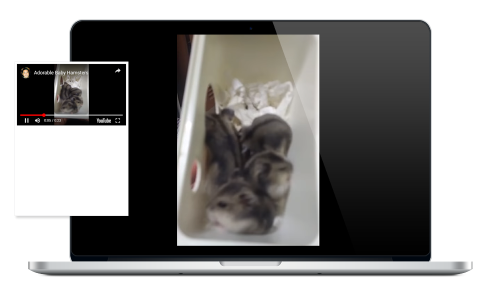
Check Out The Preview
If you find it difficult to follow this tutorial, feel free to contact me and I will be happy to assist you. I hope you find this tutorial informative, interesting and useful to your website projects. Thank you.