Good afternoon guys. I want to share with you what I just learned recently at work and it will be very useful to your projects in the future. This new tutorial is about CSS rotation animation with paused on mouse over state without the use of any Jquery codes. In order to start this tutorial, you must have at least basic knowledge of HTML and CSS technologies. If you still do not know how to code these technologies, I strongly recommend you to go to W3schools website to learn even the basics.
No more further ado, let’s start coding this cool tutorial!
First step is to setup the HTML structure
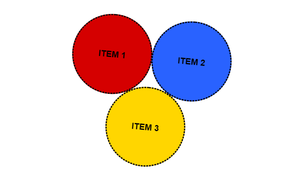
On this HTML code below, there will be 3 items (Item 1, Item 2 & Item 3) that I want to enclose inside a circle shape with 3 different colors like red, blue and yellow. We need to add CSS code though to have this kind of design.
    <!DOCTYPE html>
    <html lang="en" dir="ltr">
        <head>
            <meta charset="utf-8">
            <meta name="viewport" content="width=device-width, initial-scale=1.0">
            <title>CSS Rotation Animation With Paused On Mouse Over State</title>
        </head>
        <body>
            <ul class="items">
                <li>
                    <a href="#">Item 1</a>
                </li>
                <li>
                    <a href="#">Item 2</a>
                </li>
                <li>
                    <a href="#">Item 3</a>
                </li>
            </ul>
        </body>
    </html>
Add CSS code to style it
I have created style.css CSS file and insert it inside the css folder. So we need to make the 3 items inside a circle shape and have a rotating animation that will only paused on mouse over state. It will resume rotating on mouse out state.
<link rel="stylesheet" type="text/css" href="css/style.css">
Here’s the CSS source code below:
    ul.items {
        width: 300px;
        margin: 0 auto 40px;
        padding: 0;
        text-align: center;
        animation: rotate-me 5s infinite linear;
        -webkit-animation: rotate-me 7s infinite linear;
    }

    ul.items:hover {
        animation-play-state: paused;
        -webkit-animation-play-state: paused;
    }

    ul.items li {
        font: bold 16px Arial, Helvetica, sans-serif;
        color: #000;
        list-style-type: none;
        text-align: center;
        text-transform: uppercase;
        display: inline-block;
        vertical-align: middle;
        margin: 0 -5px -20px 0;
    }

    ul.items li a {
        width: 150px;
        height: 150px;
        color: #000;
        text-decoration: none;
        display: block;
        border: 2px dashed #000;
        padding: 65px 0 0 0;
        -webkit-border-radius: 50%;
        border-radius: 50%;
        -moz-box-sizing: border-box;
        -webkit-box-sizing: border-box;
        box-sizing: border-box;
        -webkit-transition: all 0.3s ease-out;
        -moz-transition: all 0.3s ease-out;
        -ms-transition: all 0.3s ease-out;
        -o-transition: all 0.3s ease-out;
        transition: all 0.3s ease-out;
    }

    ul.items li:nth-child(1) a {
        background-color: #D50000;
    }

    ul.items li:nth-child(2) a {
        background-color: #2962FF;
    }

    ul.items li:nth-child(3) a {
        background-color: #FFD600;
    }


    ul.items li a:hover {
        color: #fff;
        background-color: black;
        text-decoration: none;
    }

    p.text {
        font: 400 14px Arial, Helvetica, sans-serif;
        color: #000;
        text-align: center;
        margin: 0 0 20px 0;
        display: none;
    }

    @keyframes rotate-me {
        from {
            transform: rotate(0deg);
        }
        to {
            transform: rotate(360deg);
        }
    }

    @-webkit-keyframes rotate-me {
        from {
            -webkit-transform: rotate(0deg);
        }
        to {
            -webkit-transform: rotate(360deg);
        }
    }
The updated HTML structure with CSS file inside will look like this:
    <!DOCTYPE html>
    <html lang="en" dir="ltr">
        <head>
            <meta charset="utf-8">
            <meta name="viewport" content="width=device-width, initial-scale=1.0">
            <title>CSS Rotation Animation With Paused On Mouse Over State</title>
            <link rel="stylesheet" type="text/css" href="css/style.css">
        </head>
        <body>
            <ul class="items">
                <li>
                    <a href="#">Item 1</a>
                </li>
                <li>
                    <a href="#">Item 2</a>
                </li>
                <li>
                    <a href="#">Item 3</a>
                </li>
            </ul>
        </body>
    </html>
We’re done!
Check Out The Preview
If you find it difficult to follow this tutorial, feel free to contact me and I will be happy to assist you. I hope you find this tutorial informative, interesting and useful to your website projects. Thank you.