Today, I will show you how to code a radar animation using HTML and CSS. This is a cool tutorial that you can apply to a website that has an interactive map feature containing several points locations + adding radar animation to the latter.
To understand and follow this tutorial, you must have at least basic understanding on HTML & CSS coding. If you haven’t used these technologies mentioned, I strongly recommend W3schools website to know and learn the basics. Even I myself love that website in case I am searching for several codes that I’ve already forgotten and want to use it again to a particular website project.
Let’s start coding now!
First step is to set up the main HTML structure.
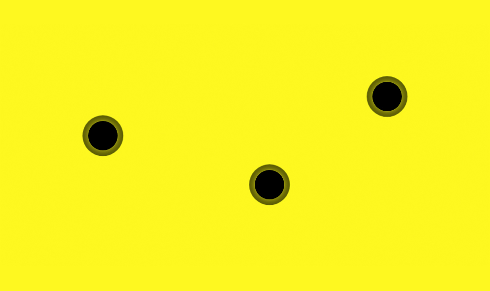
This example HTML structure is quite simple. It contains the yellow main container that serves as a
map + 3 location points. These 3 locations would need to have a radar animation that will animate continuously.
<!DOCTYPE html>
<html lang="en" dir="ltr">
<head>
<meta charset="utf-8">
<title>Radar Animation Tutorial</title>
</head>
<body>
<div id="map-container">
<!-- start radar 1 -->
<div id="radar1">
<a href="#"> </a>
</div>
<!-- end -->
<!-- start radar 2 -->
<div id="radar2">
<a href="#"> </a>
</div>
<!-- end -->
<!-- start radar 3 -->
<div id="radar3">
<a href="#"> </a>
</div>
<!-- end -->
</div>
</body>
</html>
Second step is to create the CSS file to add styling on the page.
I have created the CSS file called style.css and placed this inside the css folder.
<link rel="stylesheet" type="text/css" href="css/style.css">
Here’s the main source code of the CSS file.
    #map-container #radar3 a, #map-container #radar2 a, #map-container #radar1 a {
      width: 30px;
      height: 30px;
      background-color: #000;
      text-decoration: none;
      display: block;
      position: relative;
    }

    #map-container #radar3 a:hover, #map-container #radar2 a:hover, #map-container #radar1 a:hover {
      background-color: green;
      text-decoration: none;
    }

    #map-container #radar3 a::after, #map-container #radar2 a::after, #map-container #radar1 a::after {
      content: "";
      width: 100%;
      height: 100%;
      position: absolute;
      top: 0;
      left: 0;
      animation: radar-normal-animation 1.2s linear 0s infinite;
      -webkit-border-radius: 50%;
      border-radius: 50%;
    }

    #map-container #radar3 a:hover::after, #map-container #radar2 a:hover::after, #map-container #radar1 a:hover::after {
      animation: radar-normal-animation-hover 1.2s linear 0s infinite;
    }

    #map-container {
      width: 500px;
      height: 250px;
      background-color: yellow;
      position: relative;
    }
    #map-container #radar1 {
      position: absolute;
      top: 100px;
      left: 90px;
    }
    #map-container #radar1 a {
      -webkit-transition: all 0.3s ease-out;
      -moz-transition: all 0.3s ease-out;
      -ms-transition: all 0.3s ease-out;
      -o-transition: all 0.3s ease-out;
      transition: all 0.3s ease-out;
      -webkit-border-radius: 50%;
      border-radius: 50%;
    }
    #map-container #radar2 {
      position: absolute;
      top: 60px;
      right: 90px;
    }
    #map-container #radar2 a {
      -webkit-transition: all 0.3s ease-out;
      -moz-transition: all 0.3s ease-out;
      -ms-transition: all 0.3s ease-out;
      -o-transition: all 0.3s ease-out;
      transition: all 0.3s ease-out;
      -webkit-border-radius: 50%;
      border-radius: 50%;
    }
    #map-container #radar3 {
      position: absolute;
      top: 150px;
      right: 210px;
    }
    #map-container #radar3 a {
      -webkit-transition: all 0.3s ease-out;
      -moz-transition: all 0.3s ease-out;
      -ms-transition: all 0.3s ease-out;
      -o-transition: all 0.3s ease-out;
      transition: all 0.3s ease-out;
      -webkit-border-radius: 50%;
      border-radius: 50%;
    }
    @keyframes radar-normal-animation {
      0% {
        -moz-transform: scale(1);
        -webkit-transform: scale(1);
        -o-transform: scale(1);
        -ms-transform: scale(1);
        transform: scale(1);
        -webkit-box-shadow: inset 0 0 5px 5px rgba(0, 0, 0, 0.8);
        box-shadow: inset 0 0 5px 5px rgba(0, 0, 0, 0.8);
      }
      50% {
        -moz-transform: scale(2);
        -webkit-transform: scale(2);
        -o-transform: scale(2);
        -ms-transform: scale(2);
        transform: scale(2);
        -webkit-box-shadow: inset 0 0 5px 5px rgba(0, 0, 0, 0.4);
        box-shadow: inset 0 0 5px 5px rgba(0, 0, 0, 0.4);
      }
      100% {
        -moz-transform: scale(3);
        -webkit-transform: scale(3);
        -o-transform: scale(3);
        -ms-transform: scale(3);
        transform: scale(3);
        -webkit-box-shadow: inset 0 0 5px 5px rgba(0, 0, 0, 0);
        box-shadow: inset 0 0 5px 5px rgba(0, 0, 0, 0);
      }
    }
    @keyframes radar-normal-animation-hover {
      0% {
        -moz-transform: scale(1);
        -webkit-transform: scale(1);
        -o-transform: scale(1);
        -ms-transform: scale(1);
        transform: scale(1);
        -webkit-box-shadow: inset 0 0 5px 5px rgba(50, 101, 0, 0.8);
        box-shadow: inset 0 0 5px 5px rgba(50, 101, 0, 0.8);
      }
      50% {
        -moz-transform: scale(2);
        -webkit-transform: scale(2);
        -o-transform: scale(2);
        -ms-transform: scale(2);
        transform: scale(2);
        -webkit-box-shadow: inset 0 0 5px 5px rgba(50, 101, 0, 0.4);
        box-shadow: inset 0 0 5px 5px rgba(50, 101, 0, 0.4);
      }
      100% {
        -moz-transform: scale(3);
        -webkit-transform: scale(3);
        -o-transform: scale(3);
        -ms-transform: scale(3);
        transform: scale(3);
        -webkit-box-shadow: inset 0 0 5px 5px rgba(50, 101, 0, 0);
        box-shadow: inset 0 0 5px 5px rgba(50, 101, 0, 0);
      }
    }
    /*# sourceMappingURL=css/style.css.map */
Here’s the complete HTML structure with the CSS file inside it.
<!DOCTYPE html>
<html lang="en" dir="ltr">
<head>
<meta charset="utf-8">
<title>Radar Animation Tutorial</title>
<link rel="stylesheet" type="text/css" href="css/style.css">
</head>
<body>
<div id="map-container">
<!-- start radar 1 -->
<div id="radar1">
<a href="#"> </a>
</div>
<!-- end -->
<!-- start radar 2 -->
<div id="radar2">
<a href="#"> </a>
</div>
<!-- end -->
<!-- start radar 3 -->
<div id="radar3">
<a href="#"> </a>
</div>
<!-- end -->
</div>
</body>
</html>
We’re done!
Check Out The Preview
If you find it difficult to follow this tutorial, feel free to contact me and I will be happy to assist you. I hope you find this tutorial informative, interesting and useful to your website projects. Thank you.