Are you bored of having a plain anchor link that has underline on it? If yes, I will teach you on how to make it look cool and interesting with the use of CSS (Cascading Style Sheets). In this tutorial, I assumed that you have a basic knowledge on HTML and CSS. If not, I strongly recommend you to visit W3schools website to know even the basics.
No more further ado, let’s start coding!
Setup the HTML Structure
On this tutorial, I will use heading 1 and paragraph HTML tags with anchor links as an example.
<!DOCTYPE html>
<html>
<head>
<meta charset="utf-8">
<title>Animated Underline Tutorial</title>
</head>
<body>
<h1>
<a href="#">Animated Underline Link</a>
</h1>
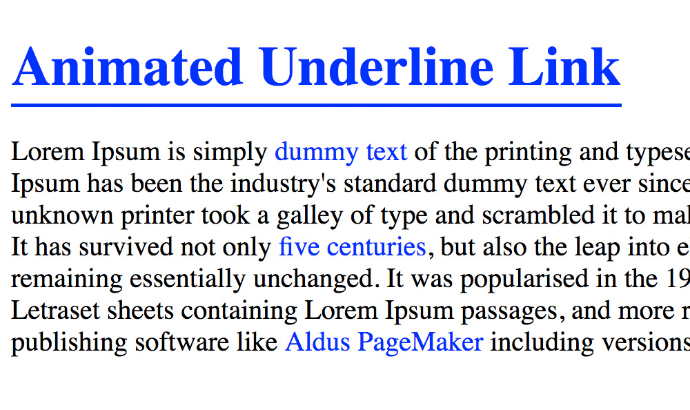
<p>Lorem Ipsum is simply <a href="#">dummy text</a> of the printing and typesetting industry. Lorem Ipsum has been the industry's standard dummy text ever since the 1500s, when an unknown printer took a galley of type and scrambled it to make a type specimen book. It has survived not only <a href="#">five centuries</a>, but also the leap into electronic typesetting, remaining essentially unchanged. It was popularised in the 1960s with the release of Letraset sheets containing Lorem Ipsum passages, and more recently with desktop publishing software like <a href="#">Aldus PageMaker</a> including versions of Lorem Ipsum.</p>
</body>
</html>
Insert CSS File
The CSS file with a filename called “custom.css” is inside the css folder.
<link rel="stylesheet" type="text/css" href="css/custom.css">
Here’s the CSS code. It concentrates more on the heading 1 and paragraph tags.
h1 a {
  color: blue;
  text-decoration: none;
  position: relative;
  padding-bottom: 5px;
}

h1 a:hover {
  color: blue;
  text-decoration: none;
}

h1 a:before {
  content: '';
  position: absolute;
  bottom: 0;
  left: 0;
  border-bottom: 2px solid blue;
  width: 0;
  -webkit-transition: all 0.3s ease-out;
  -moz-transition: all 0.3s ease-out;
  -ms-transition: all 0.3s ease-out;
  -o-transition: all 0.3s ease-out;
  transition: all 0.3s ease-out;
}

h1 a:hover:before {
  width: 100%;
}

p a {
  color: blue;
  text-decoration: none;
  position: relative;
}

p a:hover {
  color: blue;
  text-decoration: none;
}

p a:before {
  content: '';
  position: absolute;
  bottom: 0;
  left: 0;
  border-bottom: 1px solid blue;
  width: 0;
  -webkit-transition: all 0.3s ease-out;
  -moz-transition: all 0.3s ease-out;
  -ms-transition: all 0.3s ease-out;
  -o-transition: all 0.3s ease-out;
  transition: all 0.3s ease-out;
}

p a:hover:before {
  width: 100%;
}
Here’s the updated HTML structure
<!DOCTYPE html>
<html>
  <head>
    <meta charset="utf-8">
    <title>Animated Underline Tutorial</title>
    <link rel="stylesheet" type="text/css" href="css/custom.css">
  </head>
  <body>
    <h1>
      <a href="#">Animated Underline Link</a>
    </h1>
    <p>Lorem Ipsum is simply <a href="#">dummy text</a> of the printing and typesetting industry. Lorem Ipsum has been the industry's standard dummy text ever since the 1500s, when an unknown printer took a galley of type and scrambled it to make a type specimen book. It has survived not only <a href="#">five centuries</a>, but also the leap into electronic typesetting, remaining essentially unchanged. It was popularised in the 1960s with the release of Letraset sheets containing Lorem Ipsum passages, and more recently with desktop publishing software like <a href="#">Aldus PageMaker</a> including versions of Lorem Ipsum.</p>
  </body>
</html>
Check Out The Preview
If you find it difficult to follow this tutorial, feel free to contact me and I will be happy to assist you. I hope you find this tutorial informative, interesting and useful to your website projects.
Thank you.