Good afternoon. Are you get bored of coding an ordinary and boring call to action button? If yes and if you are looking for a change, I will help you to code a modern one. To follow this simple tutorial, you must have at least a basic knowledge of HTML and CSS coding. If you are still a beginner, I strongly recommend you to visit W3schools website to get familiar with. It is one of my trusted resource websites when I need the help of coding a website and searching for the right code to resolve an issue or to have a new cool feature.
No further ado, let’s start coding a modern call to action button!
First step is to set up the HTML structure.
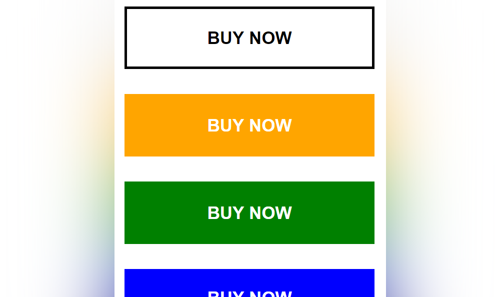
On this HTML structure, I’ve created 4 modern call to action buttons to see different variations.
    <!DOCTYPE html>
    <html lang="en" dir="ltr">
        <head>
            <meta charset="utf-8">
            <title>Modern Call To Action Buttons Using CSS</title>
        </head>
        <body>
            <!-- start call to action button example 1 -->
            <div class="cta1">
                <a href="#">Buy Now</a>
            </div>
            <!-- end -->

            <!-- start call to action button example 2 -->
            <div class="cta2">
                <a href="#">Buy Now</a>
            </div>
            <!-- end -->

            <!-- start call to action button example 3 -->
            <div class="cta3">
                <a href="#">Buy Now</a>
            </div>
            <!-- end -->

            <!-- start call to action button example 4 -->
            <div class="cta4">
                <a href="#">Buy Now</a>
            </div>
            <!-- end -->
        </body>
    </html>
Next step is to create the CSS file to add some styling and animation.
I will create the CSS file style.css and place it inside the css folder.
<link rel="stylesheet" type="text/css" href="css/style.css">
Here’s the main source code of the CSS file style.css.
    /* start call to action button 1 example */
    .cta1 {
        width: 200px;
        font: bold 14px Arial, Helvetica, sans-serif;
        text-align: center;
        text-transform: uppercase;
        margin: 0 0 20px 0;
    }

    .cta1 a {
        color: #000;
        text-decoration: none;
        border: 2px solid #000;
        padding: 15px 0;
        display: block;
        -moz-box-sizing: border-box;
        -webkit-box-sizing: border-box;
        box-sizing: border-box;
        -webkit-transition: all 0.3s ease-out;
        -moz-transition: all 0.3s ease-out;
        -ms-transition: all 0.3s ease-out;
        -o-transition: all 0.3s ease-out;
        transition: all 0.3s ease-out;
    }

    .cta1 a:hover {
        color: #fff;
        background-color: #000;
        text-decoration: none;
    }
    /* end */

    /* start call to action button 2 example */
    .cta2 {
        width: 200px;
        font: bold 14px Arial, Helvetica, sans-serif;
        text-align: center;
        text-transform: uppercase;
        margin: 0 0 20px 0;
    }

    .cta2 a {
        color: #fff;
        background-color: orange;
        text-decoration: none;
        line-height: 50px;
        display: block;
        position: relative;
        -webkit-transition: all 0.3s ease-out;
        -moz-transition: all 0.3s ease-out;
        -ms-transition: all 0.3s ease-out;
        -o-transition: all 0.3s ease-out;
        transition: all 0.3s ease-out;
    }

    .cta2 a::before {
        content: '';
        width: 0;
        border-top: 3px solid yellow;
        position: absolute;
        top: 0;
        left: 0;
        right: 0;
        margin: auto;
        -webkit-transition: all 0.5s ease-out;
        -moz-transition: all 0.5s ease-out;
        -ms-transition: all 0.5s ease-out;
        -o-transition: all 0.5s ease-out;
        transition: all 0.5s ease-out;
        -moz-box-sizing: border-box;
        -webkit-box-sizing: border-box;
        box-sizing: border-box;
    }

    .cta2 a:hover {
        color: #fff;
        background-color: red;
        text-decoration: none;
    }

    .cta2 a:hover::before {
        width: 100%;
    }
    /* end */

    /* start call to action button 3 example */
    .cta3 {
        width: 200px;
        font: bold 14px Arial, Helvetica, sans-serif;
        text-align: center;
        text-transform: uppercase;
        margin: 0 0 20px 0;
    }

    .cta3 a {
        color: #fff;
        background-color: green;
        line-height: 50px;
        text-decoration: none;
        display: block;
        position: relative;
        -webkit-transition: all 0.3s ease-out;
        -moz-transition: all 0.3s ease-out;
        -ms-transition: all 0.3s ease-out;
        -o-transition: all 0.3s ease-out;
        transition: all 0.3s ease-out;
    }

    .cta3 a::before {
        content: '';
        width: 0;
        border-top: 50px solid yellow;
        position: absolute;
        top: 0;
        left: 0;
        right: 0;
        margin: auto;
        -webkit-transition: all 0.3s ease-out;
        -moz-transition: all 0.3s ease-out;
        -ms-transition: all 0.3s ease-out;
        -o-transition: all 0.3s ease-out;
        transition: all 0.3s ease-out;
    }

    .cta3 a:hover::before {
        width: 100%;
    }

    .cta3 a::after {
        content: 'Buy Now';
        font: bold 14px Arial, Helvetica, sans-serif;
        color: #000;
        position: absolute;
        top: 17px;
        left: 0;
        right: 0;
        margin: auto;
        display: none;
    }

    .cta3 a:hover::after {
        display: block;
    }
    /* end */

    /* start call to action button 4 example */
    .cta4 {
        width: 200px;
        font: bold 14px Arial, Helvetica, sans-serif;
        text-align: center;
        text-transform: uppercase;
    }

    .cta4 a {
        color: #fff;
        background-color: blue;
        text-decoration: none;
        padding: 15px 0;
        display: block;
        -webkit-transition: all 0.3s ease-out;
        -moz-transition: all 0.3s ease-out;
        -ms-transition: all 0.3s ease-out;
        -o-transition: all 0.3s ease-out;
        transition: all 0.3s ease-out;
    }

    .cta4 a:hover {
        color: #fff;
        background-color: indigo;
        letter-spacing: 4px;
        -moz-transform: scale(1.1);
        -webkit-transform: scale(1.1);
        -o-transform: scale(1.1);
        -ms-transform: scale(1.1);
        transform: scale(1.1);
    }
    /* end */
Here’s the updated HTML structure together with the CSS file embedded on it.
    <!DOCTYPE html>
    <html lang="en" dir="ltr">
        <head>
            <meta charset="utf-8">
            <title>Modern Call To Action Buttons Using CSS</title>
            <link rel="stylesheet" type="text/css" href="css/style.css">
        </head>
        <body>
            <!-- start call to action button example 1 -->
            <div class="cta1">
                <a href="#">Buy Now</a>
            </div>
            <!-- end -->

            <!-- start call to action button example 2 -->
            <div class="cta2">
                <a href="#">Buy Now</a>
            </div>
            <!-- end -->

            <!-- start call to action button example 3 -->
            <div class="cta3">
                <a href="#">Buy Now</a>
            </div>
            <!-- end -->

            <!-- start call to action button example 4 -->
            <div class="cta4">
                <a href="#">Buy Now</a>
            </div>
            <!-- end -->
        </body>
    </html>
We’re done!
Check Out The Preview
If you find it difficult to follow this tutorial, feel free to contact me and I will be happy to assist you. I hope you find this tutorial informative, interesting and useful to your website projects. Thank you.