A pleasant good afternoon to you. Right now, I will share to you on how to do animation using CSS only. To follow this tutorial, you must have at least a basic understanding of HTML and CSS coding. If you are still a beginner, I strongly recommend you to visit W3schools website to learn the basics.
No more long introduction, let’s start coding!
First step is to setup the HTML structure.
    <!DOCTYPE html>
    <html lang="en" dir="ltr">
        <head>
            <meta charset="utf-8">
            <title>CSS Animation Tutorial</title>
        </head>
        <body>
            <div class="box">
                <h2>CSS Animation Is Fun</h2>
                <p>Lorem Ipsum is simply dummy text of the printing and typesetting industry. Lorem Ipsum has been the industry's standard dummy text ever since the 1500s.</p>
                <div class="cta">
                    <a href="#">More Info</a>
                </div>
             </div>
        </body>
    </html>
On this HTML structure, we have 3 elements to animate and these are the following listed below.
- Heading Title – H2
- Paragraph – p
- Call To Action Button – More Info
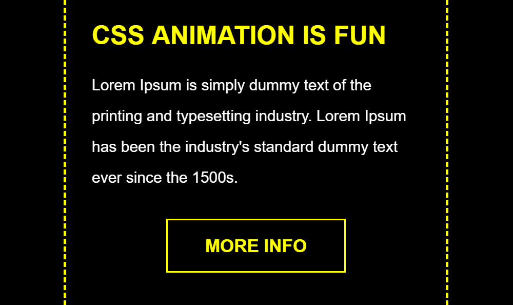
It will look like this when you open the HTML file in the browser.

It’s time to add the CSS file to give life to the HTML page.
Now, I will create a CSS file called style.css and put it inside the css folder.
<link rel="stylesheet" type="text/css" href="css/style.css">
Here’s the CSS code that contains the styling and the animation code to add the animation to the heading title, paragraph and call to action button.
    .box {
      width: 300px;
      height: 250px;
      background-color: #000;
      padding: 20px;
      border: 2px dashed yellow;
      overflow: hidden;
      position: relative;
      -moz-box-sizing: border-box;
      -webkit-box-sizing: border-box;
      box-sizing: border-box;
    }

    .box h2 {
      font: bold 20px Arial, Helvetica, sans-serif;
      color: yellow;
      text-align: left;
      text-transform: uppercase;
      margin: 0 0 15px 0;
      animation: heading-animation 0.5s linear 0s both;
    }

    .box p {
      font: normal 12px Arial, Helvetica, sans-serif;
      color: #fff;
      text-align: left;
      line-height: 24px;
      margin: 0 0 20px 0;
      animation: para-animation 0.5s linear 0.5s both;
    }

    .box .cta {
      width: 140px;
      font: bold 14px Arial, Helvetica, sans-serif;
      text-align: center;
      text-transform: uppercase;
      margin: auto;
      animation: cta-animation 0.5s linear 1s both;
    }

    .box .cta a {
      color: yellow;
      background-color: transparent;
      text-decoration: none;
      padding: 12px 0;
      display: block;
      border: 1px solid yellow;
      -moz-box-sizing: border-box;
      -webkit-box-sizing: border-box;
      box-sizing: border-box;
      -webkit-transition: all 0.3s ease-out;
      -moz-transition: all 0.3s ease-out;
      -ms-transition: all 0.3s ease-out;
      -o-transition: all 0.3s ease-out;
      transition: all 0.3s ease-out;
    }

    .box .cta a:hover {
      color: #000;
      background-color: yellow;
      text-decoration: none;
      -moz-transform: scale(1.1);
      -webkit-transform: scale(1.1);
      -o-transform: scale(1.1);
      -ms-transform: scale(1.1);
      transform: scale(1.1);
    }

    @keyframes heading-animation {
      0% {
        margin-top: -20px;
        opacity: 0;
        -moz-transform: scale(4);
        -webkit-transform: scale(4);
        -o-transform: scale(4);
        -ms-transform: scale(4);
        transform: scale(4);
      }
      100% {
        margin-top: 0;
        opacity: 1;
        -moz-transform: scale(1);
        -webkit-transform: scale(1);
        -o-transform: scale(1);
        -ms-transform: scale(1);
        transform: scale(1);
      }
    }

    @keyframes para-animation {
      0% {
        opacity: 0;
        margin-left: -100px;
      }
      100% {
        opacity: 1;
        margin-left: 0;
      }
    }

    @keyframes cta-animation {
      0% {
        opacity: 0;
        -moz-transform: scale(4) rotate(0deg);
        -webkit-transform: scale(4) rotate(0deg);
        -o-transform: scale(4) rotate(0deg);
        -ms-transform: scale(4) rotate(0deg);
        transform: scale(4) rotate(0deg);
      }
      100% {
        opacity: 1;
        -moz-transform: scale(1) rotate(360deg);
        -webkit-transform: scale(1) rotate(360deg);
        -o-transform: scale(1) rotate(360deg);
        -ms-transform: scale(1) rotate(360deg);
        transform: scale(1) rotate(360deg);
      }
    }
The code @keyframes is the main key in the CSS file in order to animate a certain element on the HTML page. On this example below, the heading element will animate coming from the top and the size is big then it will go to a certain point where it will be in a normal size. The initial state will be from 0% to 100%.
    @keyframes heading-animation {
      0% {
        margin-top: -20px;
        opacity: 0;
        -moz-transform: scale(4);
        -webkit-transform: scale(4);
        -o-transform: scale(4);
        -ms-transform: scale(4);
        transform: scale(4);
      }
      100% {
        margin-top: 0;
        opacity: 1;
        -moz-transform: scale(1);
        -webkit-transform: scale(1);
        -o-transform: scale(1);
        -ms-transform: scale(1);
        transform: scale(1);
      }
    }
Here’s the updated HTML structure together with the CSS file.
    <!DOCTYPE html>
    <html lang="en" dir="ltr">
        <head>
            <meta charset="utf-8">
            <title>CSS Animation Tutorial</title>
            <link rel="stylesheet" type="text/css" href="css/style.css">
        </head>
        <body>
            <div class="box">
                <h2>CSS Animation Is Fun</h2>
                <p>Lorem Ipsum is simply dummy text of the printing and typesetting industry. Lorem Ipsum has been the industry's standard dummy text ever since the 1500s.</p>
                <div class="cta">
                    <a href="#">More Info</a>
                </div>
             </div>
        </body>
    </html>
We’re done!
Check Out The Preview
If you find it difficult to follow this tutorial, feel free to contact me and I will be happy to assist you. I hope you find this tutorial informative, interesting and useful to your website projects. Thank you.